Na temelju članka 18. i 22. Zakona o turističkim zajednicama i promicanju hrvatskog turizma (Narodne novine br. 52/19 i 42/20), članka 3. Pravilnika o posebnim uvjetima koje moraju ispunjavati zaposleni u turističkim zajednicama (Narodne novine broj 13/22), članak 26. Statuta Turističke zajednice Općine Dobrinj (Službene novine Primorsko-goranske županije broj 18/20) i odluke Turističkog vijeća Turističke zajednice Općine Dobrinj o raspisivanju natječaja za direktora/direktoricu donesenoj na 09. sjednici dana 25.03.2026. Turističko vijeće Turističke zajednice Općine Dobrinj raspisuje
NATJEČAJ
za izbor direktora/direktorice Turističke zajednice Općine Dobrinj
broj izvršitelja: 1 izvršitelj (m/ž), na određeno puno radno vrijeme na 4 godine
NATJEČAJ za izbor direktora/direktorice Turističke zajednice Općine Dobrinj >>
Na temelju članka 18. i 22. Zakona o turističkim zajednicama i promicanju hrvatskog turizma (Narodne novine br. 52/19 i 42/20), članka 3. Pravilnika o posebnim uvjetima koje moraju ispunjavati zaposleni u turističkim zajednicama (Narodne novine broj 13/22), člank 26. Statuta Turističke zajednice Općine Dobrinj (Službene novine Primorsko-goranske županije broj 18/20) i odluke Turističkog vijeća Turističke zajednice Općine Dobrinj o raspisivanju natječaja za direktora/direktoricu donesenoj na 7. sjednici dana 24.04.2022. Turističko vijeće Turističke zajednice Općine Dobrinj raspisuje
NATJEČAJ
za izbor direktora/direktorice Turističke zajednice Općine Dobrinj
broj izvršitelja: 1 izvršitelj (m/ž), na određeno puno radno vrijeme na 4 godine
NATJEČAJ za izbor direktora/direktorice Turističke zajednice Općine Dobrinj >>
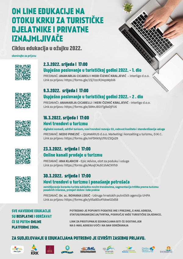
Turistička zajednica Općine Dobrinj u suradnji s ostalim TZ-ima s otoka Krka, svake srijede u ožujku organizira online edukacije / webinare putem Zoom platforme namijenjene turističkim dionicima s područja njihovih općina/grada.
S ciljem kvalitetne pripreme te upoznavanjem s trendovima i novostima za nadolazeću turističku sezonu, predavači će temama obuhvatiti sve bitne informacije vezane za poslovanje, ali i prezentirati aktualnosti, mogućnosti oglašavanja te trendove na turističkom tržištu.
Program i prijave >>
Organizacija ovih edukacija nastavak je višegodišnje prakse, kao jedna u nizu zajedničkih aktivnosti kojima se nastoji kontinuirano educirati turističke dionike te poticati na praćenje i prilagodbu turističkim trendovima.
Način izvođenja edukacija je predavanje, diskusija te pitanja i odgovori.